Stay tuned to our new posts and updates! Click to join us on WhatsApp  & Telegram
  Channel
& Telegram Channel & Telegram Channel 

Posters are an extension of movies. In a pre-digital world, they were the precursors to come first in public view, not the trailers that cloud the youtube sky like today. Satyajit Ray, a visual artist of immense caliber was particular that the posters of his films remained refreshing and different from the disappointingly dull and monotonous bandwagon. In this article, Piu Mahapatra delves in deep to see how some of these posters, when considered in pairs, whisper a story to each other.
If the posters are the extension of their movies, then they are the ones who first come in public view, either stuck on the city’s billboards like square rainbows condensed against the changing grey sky, or, maddeningly-repeated-frozen-stills zooming by on the identical pillars when viewed from the windows of moving vehicles.
They are the ones who first ignite the spark.
They are the one who initiate the silent, visual conversation with the common.
Indeed, a crucial role to play in the world of movies which constantly demand to be viewed by you and by us. Satyajit Ray knew it and commanded this tool very well.
From mid-20th century, Kolkata was used to seeing the tediously hand-painted and yet aesthetically loud posters of Bollywood movies like Shree 420 or larger-than-life Dilip Kumar comically perching on a windowsill and about to make his entrance in Azaad. The posters were disappointingly dull and monotonous stills of Bollywood hits, including Kavi (1949) and much later, Agni Pariksha(1954). Ray’s posters all of a sudden, were a set of lyrical and yet bold posters taking up the small and big billboards or the walls of the busy lanes of the city. These new-iconic visuals, used for propaganda, stood out from rest of their brothers, in their graphical narration, in their mindful selection of colours and their playful use of forms thereby making them intricately detailed yet deceptively simple.
After all, the maestro of Indian cinema and a foremost global filmmaker of the 20th century was a revolutionary graphic designer himself. He was profoundly influenced by painters like Nandalal and Binod Bihari who were his teachers at Santiniketan and who inspired him to delve into the roots and heritage of Oriental art. Ray also had the opportunity to work for years under the British advertising agency D.J. Keymer, an experience that made him a radical , then-unique graphic designer of his time and even much later.
A poster, as mentioned at the beginning of this article, is an extension, a fragment of the story that a movie will narrate to its audience later, on the silver screen. Many of these visuals were created by Ray himself and let us explore and enjoy some of his still visuals, his movie posters under a different light. If when paired and placed next to each other, can these posters start a new conversation between them and then with us?

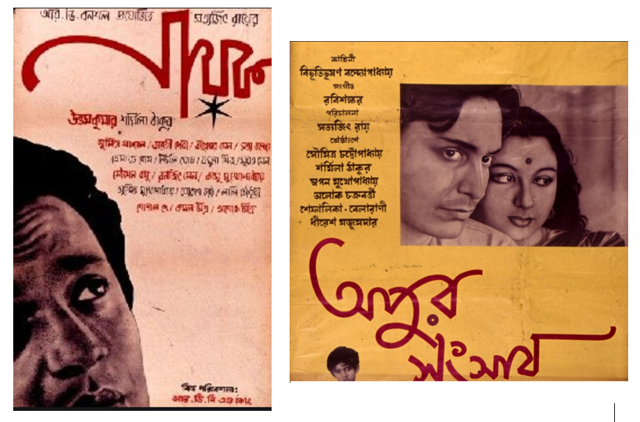
Posters of Devi and Mahanagar
Devi was set with a background of the rural Bengal of the 1860’s, even though the time considered in the original story, written by Prabhat Kumar Mukherjee, was of a Bengal seventy years earlier. In contrast, Mahanagar captures the changing big city around the 1950’s.
Two young wives, naïve and beautiful, set over a hundred years apart, one looks back to the other when paired, as if contemplating at her own reflection, who in turn gazes back to the audience with her wide, beautiful eyes and with the red ‘bindi’ burning between the eyebrows (the vermillion dot is a symbol of marriage and sometimes in some fanatic instance can be considered as a third eye).
Even though, both the posters have the monochromatic color palettes, yet how can we not notice Mahanagar and its young resident Arati captured in more black-and-grey, than her counterpart, set a decade behind her time. The chin squarely held and the lips boldly painted with red is definitely not by Arati’s hands. And intriguingly, that is the only hint of color, a dash of crimson that the poster on the right holds! Maybe, Arati, a housewife of a middleclass socio-economic background, struggling to cope up with the changing values, is closer to reality. She is the one who can be identified as a daily co-passenger of the very audience who is sitting in front of the silver screen now. Crimson, here symbolizes independence, a cool draft of freedom from how a middleclass housewife is painted and portrayed in the time when men, even Arati’s progressive husband, Subrata believes and quotes, while fondly embracing his beloved wife, ‘The best place of woman is home!’ Arati also believes that and struggles with that very quote. This dilemma coaxes her to look back at the vibrant, newlywed young girl who could hardly figure out her own identity, forget about exercising her rights to choose to live with her lawful partner. Yet Doyamoyee, the daughter-in-law, which was the only role she ever played, of a feudal and almost-fanatic Kalikinkar, is in shades of vivid red. Split in half, both in identity and lost in the world of reality and hallucination, Doyamoyee’s portrait suggests a subtle hint of smile where her lips just turn up only to decide to freeze. Whether she smiles back at herself or at us, is completely a viewer’s choice. The yellow dots decorating her both arches, another traditional custom of Bengal where the young brides get painted with sandal wood paste on the day of her marriage, look the least bit holy against the red ‘bindi’ which bleed and wash the entire face making her white eyes all the more prominent and almost challenging to return her gaze.
Both the women of different times, with their small earrings, tiny foreheads adorned with a single red dot, faced similar dilemma and confronted similar challenges being a woman. In multiple times of their life they chose others over themselves.
Ray explored texts and experimenting with typography was one of his favorite pastimes. The text, ‘Devi’ in Bengali, boldly placed at the foreground, in the identical vibrant hue suggested a temple or a mosque. The dark religious superstitions around faith may be the reason for the jagged, spiky contours. On the contrary, the word ‘Mahanagar’ is more like a planned block, something a city has with its high rises and lanes. Both the colours are wickedly chosen against their soft subtle backgrounds simply to highlight the words and never look noisy.
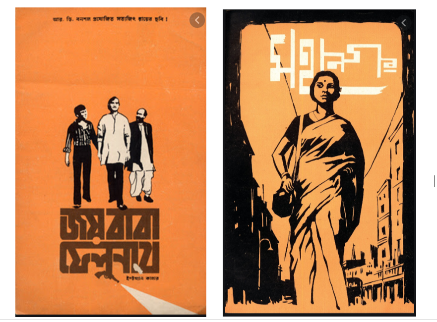
Posters of Nayak and Apur Sansar
Apu came back again and again to his known city, to his familiar audience through Ray’s lens. He appeared on screen as a six-year-old protagonist in 1955 in Ray’s first film Pather Panchali and within a year, with his youthful dreams, remained undefeated in Aparajito. In 1959 Apu showed up again in the posters in the streets of Kolkata and beyond, promising his audience to narrate the last saga of the trilogy, Apur Sansar.
Mike Kaplan, marketer, publicist and collector of Hollywood posters in 60’s, mentioned in an article on his collection of best Hollywood posters – ‘I always claimed that if a movie was good, there should be a way of making it commercially profitable. And if it hadn’t been profitable, it was due to the fact that the campaign wasn’t correct, and the campaign largely rests on two things: the trailer and the key art.’ Even though there are quite a handful of examples in all the Woods (Holly, Bolly and Tolly) of great trailers and fine posters leading to utter disappointments, nonetheless, one cannot overlook the fact that films, even the ‘art’ ones starting with a capital ‘A’ have a strong dependence on propaganda and marketing. The last word of the quote is where Ray’s posters make their mark. They are meticulously chosen single stills from his moving thousands, the effective selling points which raise enough curiosity, create an awe without entirely revealing. They are as lyrical as his films, works of art and worth a collection.
The sunlight washed background of the poster of Apur Sansar holds the picture of the young couple in a dull tone of sepia and grey. The young protagonist and his naive wife, Aparna, gently resting her chin on his shoulder is a picture of tender love – each withdrawn in their own worlds of thoughts and yet closely intimate.
Apu, the icon of a struggling hero, a middleclass youth who dreams and dares and falls and glides, is a loving face with whom most Bengalis of that time and even now can relate and associate. ‘Gaye holud’ is a blessing ceremony, a part of the Bengali marriage rituals where turmeric paste is applied on the young couple on the day of their wedding. The same hue washes the poster giving it the illusion of an auspicious invitation card coaxing us to attend. A dark ominous cloud hovers somewhere in the picture of the couple and it can be very tricky as an audience to figure out where the clouds are hiding in the midst of all the sunshine. The bold red text, one of Ray’s fonts, declares the name of the movie in a cursive casual handwritten style.
The quick black star pasted under the title ‘Nayak’ in the adjoining poster with the same name, is not only necessary to meet the requirement of the alphabet but also to symbolize the title itself – the ‘hero’ is the ‘star’ of silver screens after all. Arindam, the protagonist, the star, is placed at the foreground but in a corner creating a sense of disbalance within the composition which somehow the text at the topmost corner attempts to pacify. The compositional asymmetry tunes with the instability that ‘fame’ and ‘popularity’ brings in. Arindam, an icon of love and lush for many mothers and their young adolescent daughters, as seen in the compartment of the moving train, looks up towards Apu and Aparna with a longing for a private nook and their bliss.
Both the ‘heroes’, from two extreme socio-economy background, carry within their hearts the story of failure and void. One looks up to the other, who in turn looks away from ‘All’. Posters are extensions of the movie indeed and maybe that’s why Kajal, the young Apu again, waits down in one corner of the poster patiently, as life always finds its course to flow on and so does the fallen ‘heroes’ like Apu.
Satyajit Ray is indeed a filmmaker first. And after we honour that, we also have to acknowledge his mastery in the creative field of design and graphics. And this article, inspired by Ray’s amazing traits of storytelling, attempted to delve in deep to see if the posters, when paired or singled, also whisper a story to each other. There are few more probable pairs given here for readers to play around, imagine and enjoy!

Posters of Ganashatru and Mahapurush
‘Satyajit Ray preferred mid shots and close ups are rare moments’, the fact remains unnoticed to me, till Amitava Nag, my film critic friend mentioned this in one of his articles. However, Ray’s posters with floating bulbous heads of his protagonists and antagonists, when placed next to each other with their frozen close ups, make a pun of their very titles and question our faith and rationality, where often, we struggle to figure out who is The God’s man and who is Goddamned!

Posters of Pather Panchali and Teen Kanya
Pather Panchali is not only about Apu but also a lot about Durga, who, even after passing away one stormy night, kept on impacting and affecting the people who were dear to her. The little Apu, rushing back home at the hint of the storm, to get his father’s umbrella speaks of a child, now cautious and hardened, after experiencing the strike of death so closely.
Is it possible, when one looks at both the posters and the circles ornamenting the bright backgrounds holding the faces of the lead casts, that somewhere Ray believed, Ratan, Mrinmoyee, Monimalika, the three women of Teen Konya, are in fact, the same Durga, who returned after six years, repeating , evolving and circling each other like the ‘songs of the Little Road’?
Posters of Joy Baba Felunath and Mahanagar
And pairing the above two posters can we ponder on a ‘search’ – of the sleuth for an external truth and of ‘Her’ for an internal one?
Whether you are new or veteran, you are important. Please contribute with your articles on cinema, we are looking forward for an association. Send your writings to amitava@silhouette-magazine.com

 Soumitra Chatterjee on Acting in Satyajit Ray’s Films – Exclusive Video Interview (Part 2)
 Ray@100 Lecture 4: The Window in Satyajit Ray’s Cinema
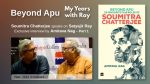 Soumitra Chatterjee on Acting in Satyajit Ray’s Films – Exclusive Video Interview (Part 1)
 Ray@100 Lecture 3: The Desiring Woman in Satyajit Ray’s Cinema
 First Impressions: Satyajit Ray’s Pather Panchali
 Ray@100 Lecture 2: Glimpses of the City in Satyajit Ray’s Cinema
Silhouette Magazine publishes articles, reviews, critiques and interviews and other cinema-related works, artworks, photographs and other publishable material contributed by writers and critics as a friendly gesture. The opinions shared by the writers and critics are their personal opinion and does not reflect the opinion of Silhouette Magazine. Images on Silhouette Magazine are posted for the sole purpose of academic interest and to illuminate the text. The images and screen shots are the copyright of their original owners. Silhouette Magazine strives to provide attribution wherever possible. Images used in the posts have been procured from the contributors themselves, public forums, social networking sites, publicity releases, YouTube, Pixabay and Creative Commons. Please inform us if any of the images used here are copyrighted, we will pull those images down.


One of the most brilliant analyses I have ever read! Hats off to Ms Mahapatra. I have been watching movies and trailers and posters all my life and never have I even considered that the creator of the movie himself would put in so much of himself in a market cheez like a poster. I remember the gigantic posters of Shin Shinaki Boobla Boo and Samson and Delilah. I also remember Waheeda once telling us blessed few how the poster of Guide which centrefaced Waheeda’s anklets and completely left out the “guide” himself led to a war of words between the creator of the poster Goldie and the hero Dev.
In this article whose opening paras read like a poem with telling imagery, our eyes are literally opened to the real artistic sensibility of Ray as in no other writeup about him I have come across. And the pairing of Nayak and Apur Sansar with the cheeky comment included is literally the cherry on the cake! Thank you again!
Not when I write or paint exactly, but after it is published or open for others, how can I deny, often I wonder…’ Piu…how will you be read?’
Mr. A Bharat…I am so very content that you read and told me in a way…to write more. Thank you and have a wonderful day!…piu
A fascinating subject – Satyajit Ray’s posters! We’ve all read his books and seen his movies, but I’m not sure how many of us have ever paid some real attention to his posters. But Piu, being the artist, art teacher and art critic that she is, has indeed with her keen vision and analytic mind paid some serious attention to this little-discussed aspect of Ray’s creativity. She takes us on a brief yet detailed journey to a whole new world of commercial creativity that was practically unknown to people like us.
Our generation was in its teens when Satyajit Ray received his Oscar and left the world a little less thoughtful a place. So, quite naturally, we have not been exposed much to the posters that propagated Ray’s films before their release. This revisit through the eyes of a painter is both revealing and enriching as on our own, we could have never figured things like “Crimson, here symbolizes independence, a cool draft of freedom from how a middle class housewife is painted and portrayed in the time when men, even Arati’s progressive husband, Subrata believes and quotes, while fondly embracing his beloved wife, ‘The best place of woman is home!’” from the poster of Mahanagar and “Doyamoyee’s portrait suggests a subtle hint of smile where her lips just turn up only to decide to freeze. Whether she smiles back at herself or at us, is completely a viewer’s choice.” from that of Devi.
We could have never figured that the yellow on the poster of Apur Sansar signifies the Bengali Gaaye Holud or turmeric ceremony and invites the viewers to the theatre to be a part of Apu and Aparna’s wedding… or that the poster of Nayak is marked by “The compositional asymmetry” which “tunes with the instability that ‘fame’ and ‘popularity’ brings in.” As a matter of fact, the idea of coupling these posters and making them converse between themselves in a visual language is what makes this article such a pleasure read.
The question that keeps buzzing in the reader’s mind till the end of the article is… are these all that Ray composed for his films? Aren’t there more? Mahanagar has been repeated and coupled with two films of very different characters, and both pairings would make you think, for sure. But Satyajit Ray made nearabout thirty feature films and all of them must have had multiple commercial posters. How many of them were designed by the maestro himself? Can’t they too converse with their counterparts? I leave the question to Piu and wait for more such revelations through the eyes of a painter.
Read the article , loved it – I have never ever looked at the posters like this – experiencing only Bollywood cinema – posters are mere information pieces – answering who, when and what? !
Because of this piece not only I am interested in knowing more about the characters from these Satyajit Ray’s movies but I now also know that posters are like book covers allowing a little window onto the world that shall open on the silver screen .
👍 👍 👍 Immaculate one. Congrats.